5 Best Product Walkthrough Software for SaaS Activation

Getting users to sign up is only half the battle. Many users abandon a product before experiencing its core value, often because they don’t know what to do next.
Product walkthrough software helps bridge that gap. From interactive onboarding flows to video-based tutorials, these tools guide users toward key actions, improve activation, and accelerate time-to-value.
In this guide, we’ll compare the best product walkthrough software for SaaS teams, including tools for onboarding, product adoption, interactive tours, and walkthrough videos.
Related Reading: What are Product Walkthrough Videos >
What Is Product Walkthrough Software?
Product walkthrough software helps users learn and adopt a product through guided experiences. By showing users what to do next, it reduces onboarding friction, shortens time-to-value, and improves activation rates.
These walkthroughs can be delivered in different formats depending on your onboarding goals.
2 Types of Product Walkthrough Software
Not all product walkthrough tools work the same way. Most fall into one of two categories:
In-App Walkthrough Software
These tools guide users directly inside your product using:
- Tooltips
- Checklists
- Hotspots
Interactive product tours
They are commonly used for onboarding, feature adoption, and user activation. Popular examples include UserGuiding, Appcues, Chameleon, and Pendo.
Video Walkthrough Software
These tools create visual tutorials that explain workflows through recorded demonstrations. They are commonly used for product demos, help centers, customer education, and feature announcements. Popular examples include FocuSee and Clueso.
Which Type Should You Choose?
The right choice depends on what you’re trying to achieve.
| Best Approach | |
| Onboard users inside your app | In-App Walkthroughs |
| Drive feature adoption | In-App Walkthroughs |
| Create product demos | Video Walkthroughs |
| Build help center tutorials | Video Walkthroughs |
| Educate users without engineering support | Video Walkthroughs |
Many SaaS companies use both: interactive walkthroughs for onboarding and video walkthroughs for deeper product education.
Product Walkthrough Software Comparison
| Best For | Type | Key Strength | Pricing | |
| UserGuiding | Startups | In-app walkthroughs | No-code onboarding checklists and tooltips | From ~$89/month |
| Pendo | Enterprise teams | In-app guidance + analytics | Deep product analytics and advanced segmentation | Custom pricing |
| Appcues | Web & mobile SaaS | In-app walkthroughs | Behavioral triggers and A/B testing | From ~$249/month |
| Chameleon | Design-focused product teams | Customizable in-app guidance | Native-like UI customization | From ~$279/month |
| FocuSee | Teams with no engineering bandwidth | Video walkthrough tool | Auto-zoom screen recording and video tutorials | One-time purchase |
The Shortlist: 5 Best Product Walkthrough Software
Here is the curated shortlist of the best product walkthrough software, categorized by their primary strength and standardized to help you compare features like segmentation and analytics quickly.
1. UserGuiding (Best for Startups)
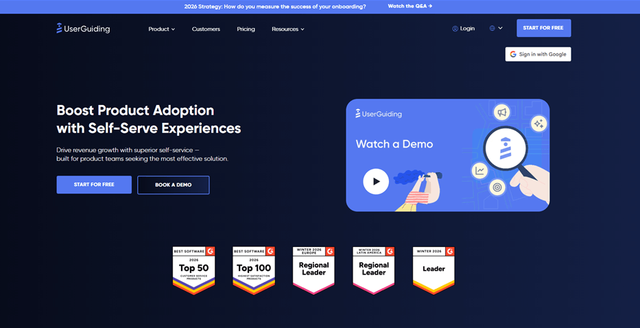
Best Product Walkthrough Software – UserGuiding
UserGuiding is a strong entry-level choice for teams needing standard onboarding checklists and tooltips without a heavy enterprise price tag.
Best For: Early-stage SaaS and startups needing quick implementation.
Key Features:
- No-Code Builder: Chrome extension allows you to highlight elements easily.
- Resource Center: A widget that houses guides and checklists.
- Segmentation: Basic user grouping based on attributes.
- NPS Surveys: Built-in tool to capture user sentiment inside the app.
The “Gotcha”: It lacks the deep, granular analytics of enterprise tools. If you need to track how a walkthrough influences retention six months later, the data reporting here might feel limited.
Pricing: Starts at ~$89/month (Basic plan).
2. Pendo (Best for Enterprise Analytics)
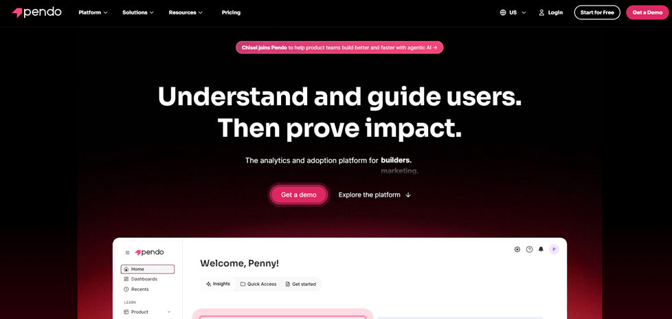
Best Product Walkthrough Software – Pendo
Pendo combines in-app guidance with deep product analytics. It is the heavyweight champion for teams that need to prove ROI with hard data.
Best For: Enterprise teams and mature Product-Led Growth (PLG) organizations.
Key Features:
- Retroactive Analytics: You can define events after installation and see historical data.
- Cross-Platform: Robust support for Web and Mobile (iOS/Android).
- Advanced Segmentation: Target users based on complex behavioral history.
- Feedback Management: sophisticated tools for gathering feature requests.
The “Gotcha”: It is expensive and complex. Pendo requires significant setup time and engineering resources to install correctly. It is often overkill for smaller teams just trying to fix activation.
Pricing: Custom quote (typically expensive).
3. Appcues (Best for Mobile & Web Parity)
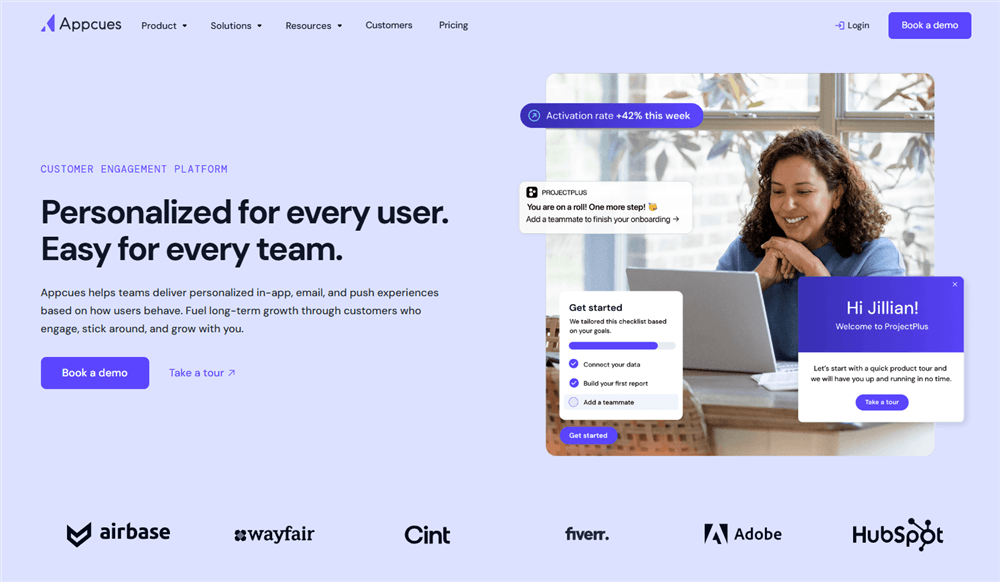
Best Product Walkthrough Software – Appcues
Known for its mature ecosystem, Appcues supports mobile app walkthroughs and complex web flows, making it a reliable choice for multi-platform SaaS.
Best For: Mid-market to Enterprise companies with both web and mobile apps.
Key Features:
- Appcues Flows: Sophisticated logic triggers (e.g., “Show this only if user is on Plan B and hasn’t logged in for 3 days”).
- A/B Testing: Native ability to test different walkthrough content to see which drives higher completion.
- Native Mobile Support: Dedicated SDKs for React Native, Android, and iOS.
The “Gotcha”: The pricing tiers can jump significantly as your Monthly Active Users (MAU) grow. You pay for the reach, not just the features.
Pricing: Starts at ~$249/month (Essentials).
4. Chameleon (Best for Native-Like Customization)
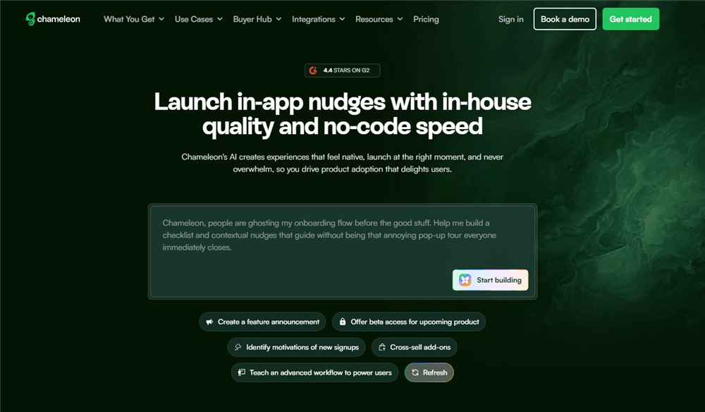
Best Product Walkthrough Software – Chameleon
Unlike legacy enterprise tools, Chameleon focuses on “in-product” experiences that look native to your UI, rather than overlays that look like pop-ups. It is a favorite among PLG companies like Mixpanel and Notion.
Best For: Product teams who care deeply about design consistency and “native” feel.
Key Features:
- Deep Customization: Offers the most flexible styling options to match your brand’s CSS perfectly.
- Launchers: In-app widgets that can trigger checklists, videos, or help articles.
- Micro-Surveys: Contextual surveys (like CES or CSAT) triggered after specific actions.
The “Gotcha”: While powerful, achieving that “perfect” native look may require a front-end developer’s eye to tweak the advanced CSS settings within the builder.
Pricing: Starts at ~$279/month.
5. FocuSee (Best for Video-Based Walkthroughs & Documentation)
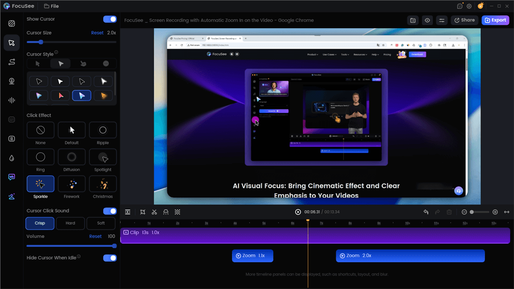
Best Product Walkthrough Software – FocuSee
For teams facing the “We don’t have engineering time” obstacle, FocuSee offers a distinct advantage. Unlike DAPs that break when your UI code changes, FocuSee creates high-fidelity video assets that exist independently of your DOM structure.
Best For: Teams with zero engineering bandwidth or products with rapidly changing UIs.
Key Features:
- Auto-Zoom: Automatically detects cursor movement and zooms in on the action (no manual editing needed).
- Cursor Smoothing: Makes erratic mouse movements look professional.
- Multiple Export Formats: Export as video or GIF to embed inside other tools (like a Chameleon modal or an email).
The “Gotcha”: This is a video creation tool, not an overlay injector. It creates passive guidance. It works best when combined with a checklist (like UserGuiding) or used for complex features where a 3-step tooltip isn’t enough to explain the concept.
Pricing: One-time purchase (Lifetime Deal options often available).
Here is a Product Walkthrough video we made via FocuSee:
Decision Matrix: In-App DAPs vs. Video Walkthroughs
Before selecting a specific tool, you must decide on the delivery method. Most buyers assume they need a code-based Digital Adoption Platform (DAP), but for many teams—especially those with limited engineering bandwidth—video is the more pragmatic solution. However, there is a trade-off between interactivity and maintenance.
Here is how to choose between In-App Overlay Tools and Video Walkthrough Tools.
In-App Overlay Tools (DAPs)
These tools inject HTML/CSS directly into your product to create tooltips, modals, and hotspots.
- The Good: High interactivity. You can force a user to click a specific button to proceed.
- The Bad: High maintenance. If your engineering team changes a CSS class (e.g., from
.btn-primaryto.btn-blue), the CSS selectors will fail, and the walkthrough will break. - Engineering Dependency: Requires SDK snippet installation. While “no-code” editors exist, developers are often needed to resolve z-index conflicts.
Video Walkthrough Tools
These create polished, visual recordings of workflows that can be embedded in help centers, modals, or onboarding emails.
- The Good: Zero maintenance. Videos don’t “break” when code updates; they only need refreshing if the UI changes significantly.
- The Bad: Passive experience. You cannot technically “force” the user to click a live button in your app; they must watch and then replicate the action.
- Time-to-Publish: Immediate.
| Code-Based Overlays | Video Guides | |
| Dev Time | High | Zero |
| Maintenance Load | High | Low |
| Interactivity | Active | Passive |
If you lack engineering bandwidth, a video-first approach avoids the technical debt of maintaining complex overlay logic. However, for critical “must-do” setup tasks, an interactive layer is often necessary.
The “Micro-Walkthrough” Strategy: Increasing Activation Without Annoyance
A common failure mode in SaaS activation is the “kitchen sink” approach: forcing every new user through a 20-step tour of the entire interface. The higher-ROI pattern is to build 2–4 short, contextual micro-walkthroughs (3–7 steps) tied directly to one activation event per persona.
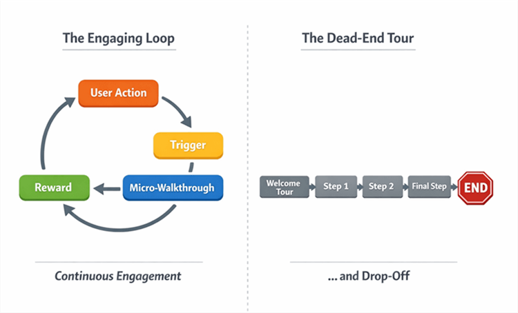
Micro-walkthroughs Flowchart
When evaluating tools, ask: can it target by role, trigger on behaviors, and measure impact on activation?
The Contextual Loop strategy
Instead of a generic welcome tour, build a guide that only triggers when a user shows intent—for example, clicking “Connect Data Source.”
- Trigger: User initiates an action (e.g., visits the ‘Reports’ tab).
- Micro-Walkthrough: A 3-step overlay (via Chameleon/Appcues) or a FocuSee video modal explains only that feature.
- Reward: The user completes the task and sees immediate value (Time-to-Value drops).
This “just-in-time” education reduces friction. When choosing software, prioritize event-based triggers over simple page-load triggers.
Maintenance Playbook: Handling UI Changes & CSS Selectors
One technical reality often omitted from sales pages is the fragility of CSS selectors. If your product team updates the class name of a button from .btn-primary to .btn-blue, your in-app walkthrough attached to that button will break.
To prevent your in-app guidance from confusing users, you need a maintenance protocol.
The Quarterly Audit
Schedule a review of your top 3 activation flows every quarter.
- Verify Targeting: Check that UI element targeting is still latching onto the correct components.
- Mobile Responsiveness: Ensure modal overlays don’t block navigation on smaller screens. [Internal Link Suggestion: Link ‘Mobile Responsiveness’ to ‘/responsive-design-best-practices’]
- Z-Index Conflicts: Ensure your guides sit above your new UI layers.
The Hybrid Solution for Fast-Moving UIs
For features that change frequently (e.g., a beta dashboard), avoid code-based attach points entirely. Instead, embed a video tutorial created with a tool like FocuSee inside a modal. Video assets are immune to DOM changes and selector breakage. This ensures users still have guidance even if the underlying code has shifted, protecting your feature adoption rates during rapid development cycles.
Implementation Plan: Your First 30 Days
Don’t try to map every feature at once. Follow this minimum viable rollout plan to prove ROI within one month.
✅ Week 1: Definition
- Identify your primary activation event (e.g., “User connects integration”).
- Ignore advanced segmentation for now; focus on the one action that correlates most strongly with retention.
- Select your delivery method (Video vs. DAP).
✅ Week 2: Build Assets
- If using DAP (Chameleon/Appcues): Build a 3-step modal flow targeting that single event.
- If using Video (FocuSee): Record a polished, zoomed-in tutorial of that specific workflow.
- Tip: Videos are often faster to ship as they require no SDK snippet troubleshooting.
✅ Week 3: Live Testing
- Launch the walkthrough to 50% of new signups.
- Monitor completion rates of the guide itself.
- Monitor the completion of the task (the activation event).
✅ Week 4: Analysis & Iteration
- Compare the Time-to-Value (TTV) of the users who saw the walkthrough versus those who didn’t.
- If the guided group activated faster, you have the data needed to justify scaling to other personas.
Frequently Asked Questions (FAQ)
What is product walkthrough software (and how is it different from product tour software)?
While often used interchangeably, “tours” generally refer to linear, comprehensive overviews (which are frequently skipped), while “walkthroughs” are task-oriented, interactive guides designed to help users complete specific goals.
Do I need in-app walkthrough software or an interactive demo tool?
If you are trying to acquire leads on your marketing site, use an interactive demo tool (like Navattic). If you are trying to improve feature adoption for users who have already signed up and are inside your app, use in-app walkthrough software (like Appcues or Chameleon).
How do I measure walkthrough success beyond completion rate?
Focus on activation events. Did the user who took the walkthrough complete the core task (e.g., “Created Dashboard”)? Product analytics tools can help correlate walkthrough views with these downstream actions.
Do any tools support mobile app walkthroughs as well as web?
Yes, tools like Appcues and Pendo offer robust mobile SDKs. However, simple video walkthroughs created with FocuSee are a universal fallback that works on any device without requiring mobile code integration.
Which tool is best if I have limited engineering resources?
If you have zero engineering availability, video-based tools like FocuSee are the safest bet. They require no code installation and no maintenance when CSS selectors change. For low-code in-app overlays, UserGuiding is a strong choice.
Conclusion
The difference between a user who churns and a user who upgrades often comes down to how quickly they reach their first “aha” moment. You do not need to build a complex, fragile web of code-based tours to achieve this. By selecting the right product walkthrough software—whether it is an analytics powerhouse like Pendo or a rapid video creation tool like FocuSee—you can take control of your onboarding funnel.
If you are ready to fix your activation rates but are worried about the maintenance of traditional DAPs, consider a hybrid approach. Use tools like Chameleon for critical “must-click” steps, and supplement them with high-quality video walkthroughs for complex concepts. Download FocuSee today to turn your screen recordings into professional, zoomed-in tutorials in minutes, and give your users the clarity they need to succeed.