Interactive Product Walkthroughs Guide: The Key to SaaS Activation

For modern B2B platforms, an interactive product demo or walkthrough is often the deciding factor between a converted customer and a churn statistic. While technical definitions matter, the emotional reality of product management is often more pressing. Consider the scenario faced by many Product Managers at growing SaaS companies: watching with frustration as high sign-up numbers evaporate into abysmal retention rates. Users abandon the tool simply because they cannot find the “start” button.
Facing a dashboard full of inactive users when you have strict growth targets is a significant obstacle. You likely find that tutorial videos go unwatched and support tickets pile up with repetitive questions. This guide explores interactive saas walkthrough strategies that solve this specific engagement gap. By moving away from static documentation and embracing product walkthrough software, teams can guide users directly through the interface, reducing friction during those critical first minutes.
Choosing the Right Method: Manual Docs, Overlays, or Simulated Walkthroughs
When deciding how to guide new users, you generally face three choices: static text documentation, code-based in-app overlays (like Pendo or WalkMe), or video-based simulated walkthroughs.
It is important to clarify a common point of confusion: “Interactive” does not always mean “live code.”
- Code-Based Overlays: These hook into your app’s code (DOM) to highlight live buttons. They are highly interactive but “brittle”—meaning if your engineering team updates the UI code, your tour breaks.
- Simulated Walkthroughs: These are interactive videos that mimic the experience of using the tool. The video pauses and waits for the user to click specific areas before proceeding. They are stable, easier to share, and do not break when your app pushes a code update.
Here is a breakdown of how these methods compare based on success metrics:
| Static Help Docs | Code-Based Overlays | Simulated Walkthroughs | |
| Technical Maintenance | Low | High (Requires Dev/QA) | Low |
| User Success Rate | Low (Requires context switching) | High | High (Learning by doing) |
| Scalability | High | High | Infinite |
| Risk of “Breaking” | None | High (Breaks with UI updates) | Low |
The Importance of Active Participation
Choosing the right format is not just about efficiency; it is about cognitive retention. Based on behavioral psychology, an interactive product walkthrough is most effective when it guides users to perform real actions, rather than just observe features.
High-performing teams design walkthroughs that require user input at each step. This ensures learning-by-doing and faster time-to-value rather than passive completion. If your current saas onboarding tools only allow users to watch a video without clicking or interacting, you are likely leaving activation revenue on the table.
The Maintenance Trap: Why In-App Tours Often Fail
Before selecting a tool, you must consider the “Day 2” reality. A major frustration for Product Managers is the maintenance burden of code-based tours.
Imagine spending weeks building a complex, 10-step tour using an in-app overlay tool. Two weeks later, your engineering team pushes an update that changes the CSS class of the “Settings” button. Suddenly, your tour is broken, pointing at space, and confused users are flooding your support inbox.
The Case for High-Fidelity Video Simulation
This is where video-based simulation—often called a “self-guided demo”—shines. Because it is a recording rather than a live code injection, it is immune to minor code changes. It allows you to simulate the “Aha!” moment without risking a broken experience during a product update.
Creating Guided Product Walkthrough SaaS Assets with FocuSee
For many PMs, the barrier to implementing a guided product walkthrough saas strategy is the need for engineering resources. Hard-coding a tour often requires JavaScript knowledge or a developer’s time—resources that are usually allocated to building core features.
This is where FocuSee serves as a specialized solution for creating simulated interactive walkthroughs. It bridges the gap between passive video and active software. FocuSee records your screen actions and automatically processes the footage into a polished video, but with a critical twist: it allows you to create a “pause-and-click” experience that feels like using the real software.
Solving the Engagement Gap with Smart Features
Users ignore generic tutorial videos because they are passive. FocuSee addresses this specific pain point through features designed to maintain visual attention and mimic interaction:
- Smart Focus & Auto-Zoom: To combat the issue where users feel overwhelmed by a busy interface, FocuSee automatically zooms in on the clicked area. This mimics human attention, guiding the eye exactly where it needs to be without manual editing.
- 3D Motionicon: Standard mouse movements can feel robotic. FocuSee adds a cinematic 3D motion to the cursor. This visual polish helps address the problem of low engagement by making the product walkthrough software output feel professional and dynamic.
- Interactive Formatting: You can structure the output so the viewer is prompted to “click” the video to advance, stimulating the “learning by doing” neural pathways without the risk of breaking live code.
By using tools that automate these visual cues, you remove the friction of video production and ensure the final asset captures the user’s attention immediately.
Designing for Action: The Golden Path Scripting Template
Creating the asset is only half the battle; the structural design of your in-app product walkthrough determines its success. A common mistake is treating the walkthrough as a museum tour of every feature. Instead, effective product adoption strategies focus on a single, meaningful workflow that leads to a quick win.
From Passive Viewing to Active Doing
Here is a critical insight: interactive product walkthroughs must guide users to perform real actions. If a user watches a video on how to create a project but does not actually create one, the activation is incomplete.
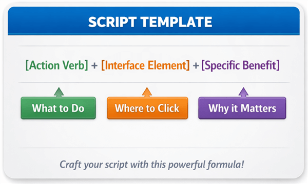
The 3-Step “Action + Benefit” Template
Do not just tell users to click buttons. Explain why. Use this scripting template for every step of your walkthrough to ensure clarity and motivation:
The Formula: [Action Verb] the [Interface Element] to [Specific Benefit].
Example Script for an Invoicing App:
- Step 1 (The Setup): “Click the ‘New Client’ button to add who you are billing.“
- Step 2 (The Action): “Select ‘Add Item’ to list your services.“
- Step 3 (The Payoff): “Hit ‘Send Invoice’ to get paid instantly via Stripe.“
Notice how Step 3 explicitly states the reward (“get paid”). This keeps the user motivated to finish the tour.
Structuring Your Sequence
To maximize user activation, follow this framework:
- Identify the “Aha!” Moment: What is the one action that proves your product’s value? (e.g., sending the first invoice, launching the first campaign, exporting a report).
- Trim the Steps: Map the user journey and remove any clicks that do not directly contribute to that moment. If a setting is optional, exclude it from the initial feature walkthrough.
- Force Interaction: Use your walkthrough software to pause playback until the user clicks the correct button. This converts the user from a spectator into a participant.
How to Create Effective SaaS Product Walkthroughs
Common Pitfalls: Why Some Onboarding Checklists and Walkthroughs Increase Churn
Even with the best intentions, a poorly designed onboarding checklist or walkthrough can increase churn. The most frequent failure mode is the “feature dump,” where a Product Manager attempts to explain every button on the dashboard in one session. This results in cognitive overload, causing the user to close the tutorial and potentially abandon the product entirely.
Tooltip Overload and UX Failures
Be wary of “tooltip overload.” If your screen is covered in popping bubbles, the user will not know where to look. An effective interactive product walkthrough for saas should present one piece of information at a time.
Furthermore, ensure your flow does not result in navigation failures. A walkthrough that instructs a user to click a button that is currently hidden behind a paywall or a permission setting is a guaranteed way to erode trust. This is another reason why simulated video walkthroughs are safer—they always show the “ideal state” of the software, regardless of the user’s specific permission level.
Corrective Actions for Better Retention
To improve your user activation rates, audit your current flows for these issues:
- Simplify: Limit the walkthrough to 5-7 steps maximum.
- Verify: Ensure every step is achievable for a brand-new account with zero data.
- Escape Hatch: Always provide a clear “Skip” or “Exit” button so users do not feel trapped.
The Shift to Product-Led Growth: Why Traditional Support Fails
The industry shift toward product-led growth (PLG) has fundamentally changed the requirements for user onboarding. In a PLG model, the product must sell itself. Support teams can no longer afford to handle repetitive questions like “how do I invite a teammate?” or “where is the settings menu?”. These Level 1 inquiries drain resources that should be focused on technical troubleshooting or enterprise account expansion.
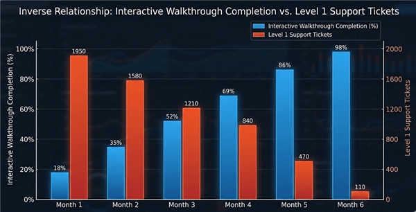
Interactive Walkthrough Completion
Why Documentation is Ignored
Modern users have been conditioned to expect immediate utility. When they encounter friction, they rarely open a new tab to search a knowledge base. They simply churn. In-app guidance bridges this gap by delivering the answer exactly when the question arises.
Measuring Impact
To validate the investment in interactive onboarding, look beyond simple completion rates. The true metrics of success are:
- Time-to-Value: How much faster does a user reach their first success moment with the walkthrough versus without it?
- Support Ticket Deflection: There is often a direct correlation between effective feature walkthrough deployment and a reduction in basic support tickets.
- Activation Rate: The percentage of sign-ups that convert to active users within the first week.
Conclusion
The difference between a user who churns and one who becomes a loyal advocate often lies in their first five minutes with your product. If users feel overwhelmed or lost, no amount of email marketing will bring them back. By replacing static documentation with an interactive product walkthrough, you solve the core problem of user confusion and engagement.
You do not need to risk breaking your app with brittle code injections to get this result. Tools like FocuSee allow you to create professional, visually engaging simulations in minutes, giving you the power to fix your onboarding flow immediately without waiting for a sprint cycle. Regain control over your activation metrics today by creating guidance that actually works.
Frequently Asked Questions on Product Walkthroughs
What is the difference between an in-app overlay and a video walkthrough?
An in-app overlay uses code to highlight live buttons on your actual interface. It is highly immersive but requires engineering maintenance and can break if your UI changes. A video walkthrough (or simulated walkthrough) creates a recorded environment where users “click” to advance. It is more stable, easier to produce, and perfect for marketing assets or help centers.
Does “interactive” always mean “live software”?
No. In the context of SaaS onboarding, “interactive” means the user is participating rather than passively watching. A video that pauses and requires a user to click a specific area to proceed is considered interactive because it engages the user’s attention and reinforces muscle memory.
How do I handle UI updates with my walkthroughs?
If you use code-based overlays, you will likely need a developer to update the selectors every time your UI changes. If you use a tool like FocuSee, you simply record a new clip of the updated feature. This ease of update is why many agile teams prefer video simulation over hard-coded tours.
How long should a product walkthrough be?
Ideally, a walkthrough should be as short as possible to achieve a single goal. Most experts recommend keeping it between 5 to 7 steps or under 90 seconds if it is video-based. The goal is to deliver a “quick win,” not a comprehensive education.
Can I build walkthroughs without engineering help?
Yes. Modern product walkthrough software allows Product Managers and Marketers to create visual, guided assets without writing code. These tools significantly reduce the dependency on development teams.
How do I measure the success of a product walkthrough?
Success should be measured by the actions users take after the walkthrough. Key metrics include the completion rate of the walkthrough itself, the reduction in time-to-value (how fast they perform the core task), and the deflection of Level 1 support tickets related to that feature.